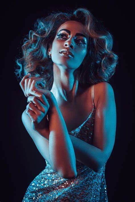
The subject is very concentrated on what she was looking at. The split gel colors are very appealing to see. The contrast and lighting is split evenly so the photo doesn’t look blotchy or uneven. The blue gel goes very well with the mood and subject’s expressions. The subject seems to fit in very well with the scenery and not seem like an outcast or the background being in more focused than the subject.